Sunday, January 1, 2012

The Man in the Moon

While I may be a film archivist by trade and by training, I was a film lover far earlier, so I'm torn by Martin Scorsese's new labor of love Hugo (2011). For while I appreciate the passion for film it engenders, its embracing of the medium in its earliest days, and its position on resurrecting and preserving the past for future generations to admire and adore, it finds its way to this magical reenactment by way of high tedium. For Hugo the orphan waif is the least interesting thing about Hugo the movie, and the mystery that unfolds about his past and the way his fate intersects with Georges Melies is not nearly as enchanting or engrossing as it needs to be to justify the wait. Call him Oliver Listless.

I think Scorsese has always had this problem with period films. The Age of Innocence goes beyond conveying oppressive social mores and is itself suffocating amidst unimpeachable production values. Gangs of New York is all posturing until the point when the feuding tribes get overwhelmed by the larger sweep of history, a tantalizing promise of something grander that goes largely unfulfilled (compare this with Ron Shelton's lean, underappreciated Dark Blue ). New York New York is insufferable because we're on a journey with a protagonist who constantly offends but never intrigues.

In each, the tone is just slightly off enough that the experience is never full immersive the way his best films are. Scorsese's style is never invisible, for Taxi Driver or Raging Bull are special because of his unique perspective and directorial flourishes. But it always feels organic to the temperament of the narrative, setting or characters. No one will argue that GoodFellas is a short or economical film, but it's got blood in its veins and a pulse that propels you forward on pure energy, style, and a perverse combination of warmth and anxiety. But like the gadgets and gears that Hugo obssesses over, Hugo is a clockwork orange--hopelessly trying to resemble something sweet and fleshy, but all empty (and poorly-calibrated) mechanics inside.

I will admit, though, that if the film does ignite renewed interest in early (pre-Griffith) cinema, that's always a good thing. Georges Melies understood the magical quality of cinema that had less to do with storytelling and more with showmanship. Camera movement, continuity, all the things we associate with cinematic "language" may have developed later, but he was never afraid to be as whimsical and fantastical as his imagination (and resources) allowed. And these moments of the artist at play are the best of the film, infusing real magic into the proceedings, because it's only at this point do we finally believe in what Scorsese is selling--not all the phoney-baloney 3D city-of-light trappings that proceed it (again, for a more luminous demonstration of the magic of Paris, just revisit Woody Allen's latest achievement, which finds that elusive balance of a grounded flight-of-fancy that such an amazing city deserves).

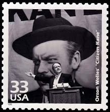
This French first day cover I own also represents the first filmmaker to ever get a postage stamp anywhere in the world (I'm not counting Edison or Will Rogers, who did get USPS issues pre-1961). The stamp itself depicts not only the legendary pioneer, but footage of the cannon that our intrepid lunar explorers use to reach their destination in the seminal Le Voyage dans la Lune (1902). But what everyone best remembers from the film is The Man in the Moon, irritated by the capsule that blinds one eye. Even a century later, it's still the most iconic cinematic image of that celestial body. The first time I remember hearing about the Man in the Moon was the nursery rhyme

"The man in the moon came down too soon,
and asked his way to Norwich.
He went by the south and burnt his mouth
By supping on cold plum porridge."

Little did I know that decades later, my love of film and the need to preserve it would take me to Norwich, but the image of the man irritated at his encounter with earthlings still lingered. In Scorsese's film, Melies (played by Ben Kingsley, the film's best performance) benefits by reconnecting with the real world. A new lease on life is possible once he lets other people in, and allows the past that haunts him to find its proper place, moving forward with his life instead of being crippled by grief or self-pity at past failures. And his legacy is reaffirmed as a result.

But this New Year's, I envy that Man in the Moon, so distant from human contact. For my failures are present and immediate, and my legacy far more dubious. And while the Man is usually perceived as observing remotely, separate and isolated, he still is the Moon and his orbital pull still affects the tides, despite his best efforts. The 1st is often a time for resolutions and the promise of renewal, and as far as new beginnings go, I've never faced so many or of such gravity as I do now. For me, 2012 will be about looking back (with nostalgia and regret) but still trying to move forward, step by step. Even if the destination feels as far away as the moon. And as lonely.


Saturday, December 24, 2011

A View from the Bridge

A holiday standard now, Frank Capra’s It’s a Wonderful Life (1946) is a film that’s easy to take for granted and even easier to underestimate. The idyllic small town life of Bedford Falls, the overly-cutesy courtship of George and Mary, the knee-jerk sentimentalism about human nature are what we’d come to expect from Capra. And while there are charming moments or marvelous little grace notes, it’s undeniable that he lays it on a bit thick, especially with Clarence’s running commentary.

But Jimmy Stewart may be America’s greatest actor, and Life is a film on the cusp of his career, since it revels in his effortless folksy charm, often parodied but never less-than-believable, but it also anticipates the darker Stewart who’d flourish in the 1950’s—the Stewart with disturbing pathologies (the Hitchcock films) or with the raw nerves of obsessive behavior (the brilliant Anthony Mann westerns). For it’s in the last half hour that Life really takes wing, with a fantasy element that submerges itself into unadulterated nightmare.


Much of Pottersville might seem pretty tame to us now. And I’ve known more than my fair share of librarians who laugh at Mary’s horrible fate without George (though it’s hard to imagine Donna Reed not ever landing another beau). But to have your world turned upside down in an instant, to have every memory and place and association called into question, to have your entire reality thoroughly upended (especially those things that you'd grown to love and cherish)—I can only imagine how horrible it must be. And Stewart sells it thoroughly. It's not a film I revisit often, but when I do, I am still surprised by the darkness at its center.

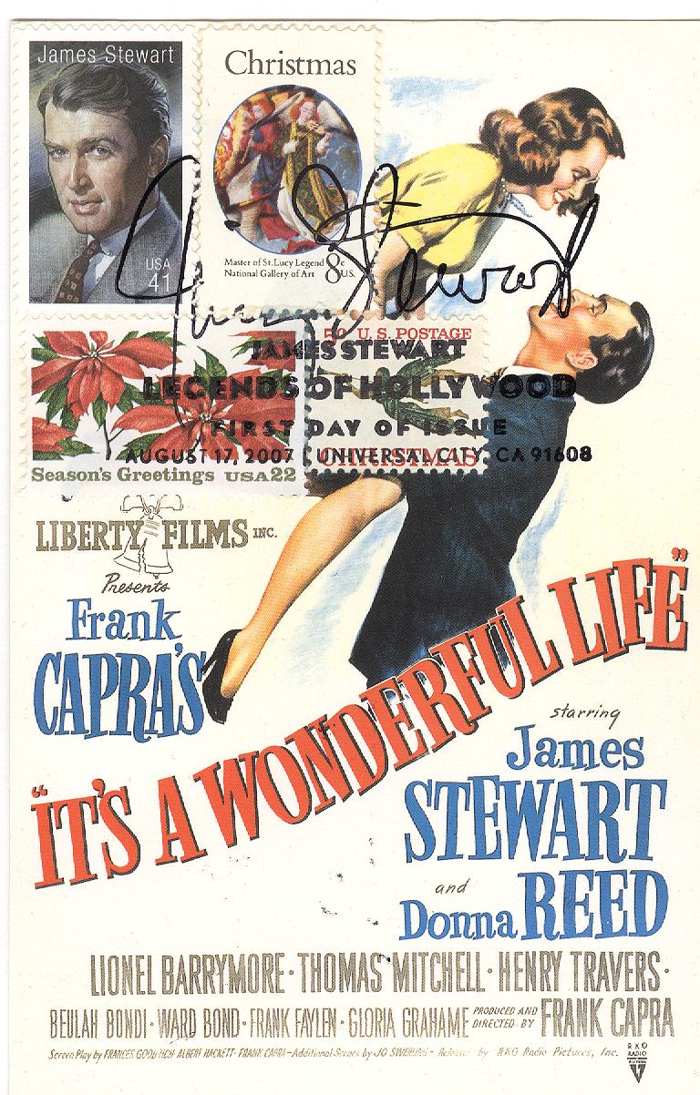
There are no shortage of Christmas stamps available, so when the Stewart release came out (Scott #4197), I tried to select some that had a very traditional feel to them and which matched the color scheme of the one-sheet pictured.

Angel (1965 – Scott #1276)
Virgin Mother (1972 – Scott #1471)
Poinsettia (1985 – Scott #2166)


As for the reverse side, I figured throwing some more Christmas stamps in would be fun, since I needed to add the Barrymores (Scott #2012; Lionel plays Mr. Potter) anyway.

Sleigh (1983 - Scott #1900)
Ornament (1987 – Scott #2368)
American Holly (1997 – Scott #3177)

This is in addition to the Tiomkin stamp (Scott #3340) that I piggybacked onto the First Day Cover of the American Filmmaking series (Screenwriting – Scott #3772a) back in 2003. Total face value of all the stamps pictured: $2.66 (and 2/10).

A film like Life invites one to examine the impact you’ve had on others’ lives—inadvertent or otherwise. How your actions cause ripples in the pond, ones that reverberate beyond your own awareness. George never made a name for himself outside of his town, never conquered the world. But his decency was profound, and so was his impact. He sometimes may feel trapped in his life, but he still has choices. He never embezzles money from the Building and Loan. He never cheats on Mary. He lives on his word, his integrity, and the community responds in kind when he needs them.

George could easily appear a plaster saint, a glib archetype of the Everyman Stewart is often best remembered for. But there are far worse things in this world than to be staid and boring and decent. Sometimes, the ripples you set off aren’t ripples, but waves that capsize the boats of others—not just in an alternate life, but in a real world nightmare of your own creation. To have a legacy where you know you’ve made someone’s life worse, not better—it’s a heavy, heavy thing.

Clarence tells George “No man is a failure who has friends.” I wish that were true. But like Zuzu’s petals, I have a buckeye in my pocket—one I’ve kept there for 15 years, reminding me often of those who mattered, but more recently of those I’ve damaged. Perhaps irreparably. For it was a wonderful life. But I’m no George Bailey. And while the future remains uncertain, it will be quite a while before those waves stop crashing.

Saturday, November 19, 2011

Maximum Review


It’s been a while since I discussed maximum cards, and while they don’t pop up often in my collecting, the recent X-men post reminded me that I should highlight a few that I’ve created since I last wrote about them.

I don’t typically collect art postcards, but when the abstract expressionist issue came out, I went to one of the few remaining postcard stores I know and found this painting of Robert Motherwell’s "Elegy to the Spanish Republic #34" (Scot #4444g).  This is a maximum card in its most traditional sense.

I will admit to never having seen a single episode of The Honeymooners (Scott #4414t), but I found a few postcards for the show on E-Bay, including this one, which has Jackie Gleason’s face virtually identical in both stamp and card.  If you look carefully, though, you can see Art Carney’s face is slightly different in the two photos.  Still, pretty darn close. 


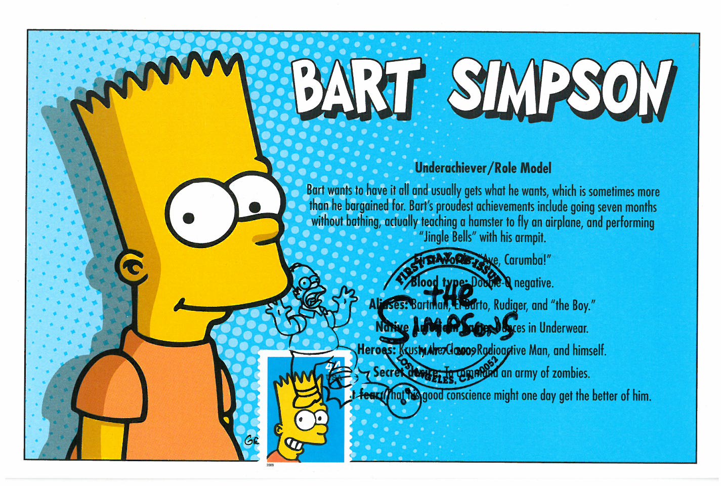
This profile of Bart Simpson (Scott #4401) also has a slightly different facial expression but given the matching background color, also comes very close as well.

And of all 20 different Disney stamps issued between 2004 and 2008, this stamp from Lady and the Tramp (Scott #4028) most closely resembles any of the postcards I used for the First-Day-of-Issue postmark.


Thursday, September 22, 2011

We Don't Need Another Hero


Four big budget comic book movies this past summer, and while none were overtly bad, none was particularly good, either. The period playfulness of Captain America’s production values and Michael Fassbinder’s commitment to Magneto stood out, but it was mostly silly and disappointing, though not the last we’ll see of any of them I suspect (except perhaps Green Lantern - Scott #4084l).

The DC and Marvel comic postage issues yielded few opportunities for movie-related FDC’s (at least based on my collection), but I had other postcards at my disposal. The X-Men one (Scott #4159t) was the best because it’s a true Maximum Card, with the stamp and the postcard being exactly identical. As for poor Thor, he didn’t even merit his own stamp, though you can see him way in the background of Cap’s stamp (Scott #4159o). For his comic, I settled for the Spider-Woman cover stamp (Scott #4159q), since it also features Nick Fury, who will be wrangling the Avengers for next year.

Thursday, August 11, 2011

Here Comes the Smudge


You already know about my first encounter with the USPS and first-day-of-issue postmarks.  But the cover I scanned in that post was one I bought onsite.  However, on that day, I also brought some classic film star postcards myself to get my own postmarks—the first time I’d ever tried this.


Note all the black ink smudges on the left side of each card.  As you can see, this was not such a great idea. 

That day, the postal employees with the cancellation stamp were in the lobby of San Francisco’s magnificent Castro theater, and as I gave them the postcards, they stamped each one individually.  However, the ink on the cancellations didn’t have a chance to dry before they handed the cards back to me in a stack, ready to move on to to the next customer.  As a result, ink from the back of one postcard (where the postage stamp was) ended up partially defacing the front of another postcard (with the image) in the stack.  If I had known better, I would’ve put the postage stamp on the front, with the image, so even though the cancellation might still get a little smudged, it would only end up marking up the back of the next postcard, which nobody would see. 

I don’t know how the Postmaster stations handle it now, with the large volumes of covers and cards they must receive for each new issue, but I’ve never had a problem with the cards smudging merely from touching each other (and believe me, on some issues, I’ve given them an enormous amount of cards to stamp).  Sometimes, I imagine some sad little postal worker at a small table in a windowless room, holding a cancellation stamp, inking it, and then pressing down on one mass-produced envelope after another.  And another.  And another.  I know my postcards are unique in this respect, since they’re created by hand, different from anything else this employee would encounter.  Do they represent a welcome change of pace to this lonely worker?  Do they enjoy my attempts at creativity in assembling the cards?  Or is it just another part of the job they look forward to putting behind them?
Yes, I actually wonder about these things.

Harold Lloyd is Scott #2825 and Rudolph Valentino # 2819.

Tuesday, July 19, 2011

Great Scott


It’s hard to believe that Thelma & Louise was released 20 years ago. I was in college at the time and remember all the controversy about feminist outrage and confronting misogyny (both overt and latent). I haven’t seen it again since—it’s not the type of film that gets replayed on TNT the way other “chicks with guns” films like Aliens and Terminator 2 are. But I remember that even back then, the Grand Canyon jump was a cheap and inauthentic end to two beautifully realized characters, with the final freeze frame of the car in the air a royal cop-out to an otherwise engaging movie.

What I liked about the film most, though (besides some terrific performances across the board) was that it was the only film that gave Ridley Scott visual breathing room. From Alien to Blade Runner to Black Rain, his films were suffused with imagery that was wet and dark and claustrophobic. But this film showed that he can handle sunshine and wide open spaces, that he had a directorial gift for American landscape as a complement to his heroines’ road trip. Sadly, even though subsequent efforts like Blackhawk Down and Gladiator take place largely outdoors, the style is still visually cluttered and oppressive. Thelma is a window into a career that might have been—a spare, linear, natural sensibility that allows for the fact that empty space need not be devoid of ideas.

I love to go camping and have been to the Grand Canyon, but never both together (nor have I explored farther than the south rim). Hopefully one day. The Grand Canyon stamp (Scott #4054) from the Wonders of America series gave me an opportunity to pull some older Grand Canyon stamps as well, the oldest of which is from 1934 (Scott #741) as part of a National Parks series. The other two are Scott #2512 & C135 (which designates an Air Mail stamp).

Sunday, June 19, 2011

Polite Society


Although we're constantly overrun with inferior remakes these days, it's not a new phenomenon. This still has Frank Sinatra (Scott #4265) and Bing Crosby (Scott #2850) serenade each other in High Society (Walters, 1956), a musical revisitation of the superior The Philadelphia Story. While the original Cukor film is spritzy, it still has emotional weight. But High is just that: light as a feather, cute and charming but of no real consequence, with zero sexual chemistry and musical numbers, despite the involvement of such heavy-hitters, that evaporate as soon as you've heard them.

I’ve included the one sheet, which also has the stamps for Grace Kelly (Scott #2749); Cole Porter (Scott #2550),who wrote the entire score; and the Rhode Island stamp (Scott #3599) from the Greetings from America series, complete with sailboat, one of which is prominently featured in the film. Paired up with the Porter stamp is the Music stamp (Scott #3772d) from the American Filmmaking series, complete with Oscar silhouette on the postmark (Porter was nominated for his song “True Love”, which was also the name of the sailboat in the film).

You’ll also notice that the two Louis Armstrong stamps are slightly different from each other, with the lettering alternating between white and black (the difference being that one was sold individually, while the other was sold as part of a strip with other jazz legends). The Scott #’s are 2982 and 2984 respectively.