Showing posts with label Maximum Card. Show all posts

Thursday, December 29, 2016

Luminous Beings


In what now seems a lifetime ago, I once had to go through tens of thousands of feet of 16mm behind-the-scenes footage from the original Star Wars trilogy.  Most of this was not shot on the set, but rather with the effects crew, model and creature shops, and other artists commonly known as “below the line” but critical to any movie’s success, especially those.  So you rarely saw much of the cast, but one memorable sequence was Carrie Fisher in her (in)famous slave bikini outfit from Return of the Jedi (1983, Marquand) sunbathing in the Arizona desert during a break, side by side with her similarly costumed stunt double.  And it was a jarring moment because you actually saw her interacting with another woman.

For let’s face it—the original three films are a sausage fest and Bechdel test nightmare.  There are only 3 female speaking parts in the whole trilogy—the short-lived Aunt Beru, the blink-and-you-miss her Mon Mothma (recently revived in the terrific Rogue One), and Princess Leia Organa.  So Carrie had to do the heavy-lifting for all 3 films when it came to female characterization, since she was both love interest and leader of the Rebellion.  Powerful, commanding, willing to stand toe-to-toe with anyone she came up against (Vader, Tarkin, Jabba) but also kind, caring, and authentic.  One of the highlights of Star Wars: The Force Awakens was seeing her back in action, still filled with authority and compassion.  The fact that the last two franchise films have had women at the center of the heroics is due in large part to her influence. 

Of course, since then she has also proven herself a witty writer and raconteur, smart aleck and cinematic sidekick, member of a vibrant-but-troubled Hollywood dynasty, an object lesson about addiction and an ambassador for destigmatizing mental health issues.  And she leaves us just a few months after her co-star Kenny Baker (who played R2-D2) and, tragically, one day before her mother Debbie Reynolds.

Just a month ago, I saw a sneak preview of Bright Lights (2016, Bloom/Stevens), a documentary about Carrie & Debbie.  It's a marvelous film in how it shows the once tumultuous mother-daughter relationship that evolved into one of deep love and support, but leavened with an enormous amount of playful ribbing, snark, and self-deprecation.  They had come to terms with the demons of the past and were both continuing to dive into creative pursuits fueled by wisdom and nostalgia.  So much of their personal bad luck and bad choices were scandal sheet fodder for so long, that there was little choice but to face the future with bravado and pluck.  The film follows each of them individually (Debbie rehearsing a one-woman show, Carrie attending a scifi convention), but the best parts are when they are together.  They come off as best of friends and savvy partners in crime, and it really did seem hard to imagine how one could exist without the other.  Both full of such indomitable spirit in the film, and both gone much too soon (Carrie at 60, Debbie at 84).
Another wonderful thing the film highlights is Debbie’s tireless campaign to save the artifacts of Hollywood history, particularly the costumes—not just of her films, but of films that predate her and that would have otherwise been thrown out by studio departments who were, back then, far less interested in preserving their past than making space for the latest productions.  Pieces that she purportedly saved over the years (through fundraising and her own backlot connections and initiative) include Charlie Chaplin’s bowler, Elizabeth Taylor’s Cleopatra headdress, Marilyn Monroe’s subway grate dress from The Seven Year Itch, and Judy Garland’s Oz ruby slippers.

One of my favorite songs is “Graceland” by Paul Simon, who was once married to Carrie, and whose relationship with her is documented in that song (among many others).  It’s a song about renewal and second chances, and when I drove across country last year, I listened to the whole Graceland album as I approached Memphis to visit Elvis’s legendary estate of the same name.  In the song, Simon writes about his ex:
She comes back to tell me she's gone
As if I didn't know that
As if I didn't know my own bed
As if I'd never noticed
The way she brushed her hair from her forehead
And she said losing love
Is like a window in your heart
Everybody sees you're blown apart
Everybody sees the wind blow
Life is a pilgrimage and we should all be so lucky as to have it filled with grace (in both the poetic and spiritual dimension).  Yoda says to Luke, “Luminous beings are we, not this crude matter.”  2016 was a rough year for a lot of people for a lot of reasons.  May the road we take in 2017, portentous clouds notwithstanding, be filled with the light, courage, good humor and fierce resolve that they both embodied so well.

Carrie and Kenny share a USPS stamp, essentially, from the Star Wars issue back in 2007.  That is Scott #4143f .  The X-wing fighter is #4143m.  The Wizard of Oz stamp is #2445, Judy Garland #4077, and Yip Harbug #3905.  The music stamp from the American Filmmaking series is #3772d.  And Elvis is #5009.  Incidentally, the first film poster on a postcard I ever owned was a gift from my high school girlfriend.  It was for Singin’ in the Rain, still one of my favorite films ever.  I’ve included it here, along with the inscription she wrote on the back, since this whole blog & collection originated, in a sense, with her.

My 10 favorite films featuring Debbie*, Carrie+, or Kenny#.
1. Singin’ in the Rain (1952, Donen/Kelly) *
2. The Empire Strikes Back (1980, Kershner) +#
3. Hannah and Her Sisters (1986, Allen) +
4. Time Bandits (1981, Gilliam) #
5. Kiki’s Delivery Service (1989, Miyazaki) *
6. The Elephant Man (1980, Lynch) #
7. When Harry Met Sally… (1989, Reiner) +
8. Mona Lisa (1986, Jordan) #
9. Star Wars (1977, Lucas) +#
10. The Blues Brothers  (1980, Landis) +


Saturday, November 19, 2011

Maximum Review


It’s been a while since I discussed maximum cards, and while they don’t pop up often in my collecting, the recent X-men post reminded me that I should highlight a few that I’ve created since I last wrote about them.

I don’t typically collect art postcards, but when the abstract expressionist issue came out, I went to one of the few remaining postcard stores I know and found this painting of Robert Motherwell’s "Elegy to the Spanish Republic #34" (Scot #4444g).  This is a maximum card in its most traditional sense.

I will admit to never having seen a single episode of The Honeymooners (Scott #4414t), but I found a few postcards for the show on E-Bay, including this one, which has Jackie Gleason’s face virtually identical in both stamp and card.  If you look carefully, though, you can see Art Carney’s face is slightly different in the two photos.  Still, pretty darn close. 


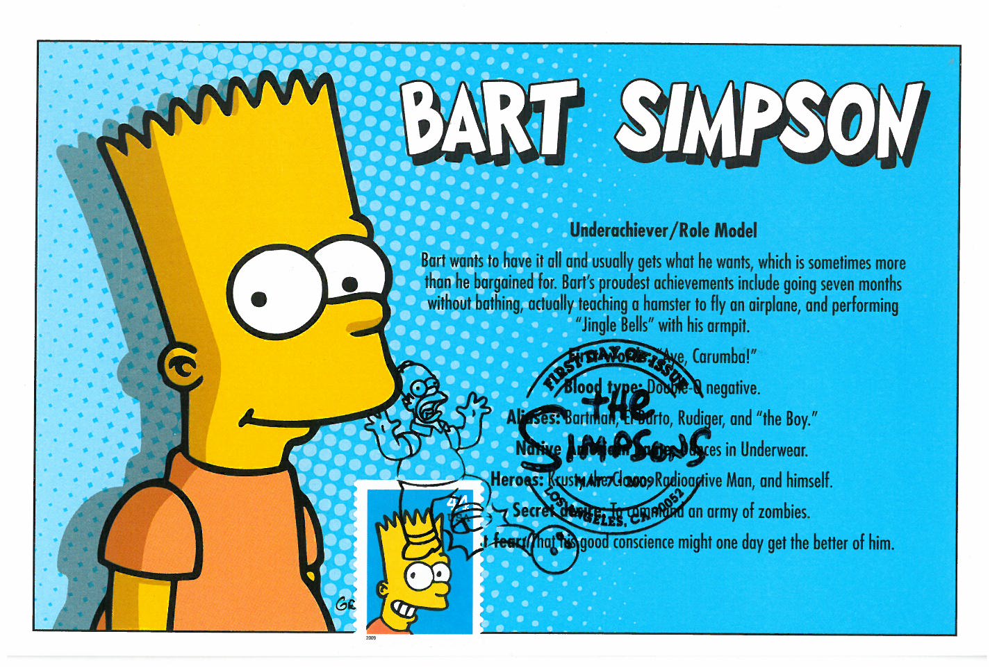
This profile of Bart Simpson (Scott #4401) also has a slightly different facial expression but given the matching background color, also comes very close as well.

And of all 20 different Disney stamps issued between 2004 and 2008, this stamp from Lady and the Tramp (Scott #4028) most closely resembles any of the postcards I used for the First-Day-of-Issue postmark.


Thursday, September 22, 2011

We Don't Need Another Hero


Four big budget comic book movies this past summer, and while none were overtly bad, none was particularly good, either. The period playfulness of Captain America’s production values and Michael Fassbinder’s commitment to Magneto stood out, but it was mostly silly and disappointing, though not the last we’ll see of any of them I suspect (except perhaps Green Lantern - Scott #4084l).

The DC and Marvel comic postage issues yielded few opportunities for movie-related FDC’s (at least based on my collection), but I had other postcards at my disposal. The X-Men one (Scott #4159t) was the best because it’s a true Maximum Card, with the stamp and the postcard being exactly identical. As for poor Thor, he didn’t even merit his own stamp, though you can see him way in the background of Cap’s stamp (Scott #4159o). For his comic, I settled for the Spider-Woman cover stamp (Scott #4159q), since it also features Nick Fury, who will be wrangling the Avengers for next year.

Friday, February 19, 2010

Having a Ball


Of all the contrivances and far-fetched situations in Pretty Woman, the one that brought me most out of the movie was when Vivian (Julia Roberts) sits down to watch I Love Lucy and claims to have never seen the episode airing (“Lucy’s Italian Movie”, with the wine-stomping sequence). How in the world could someone from my generation make it to their mid-20’s and not have seen that? Growing up, Lucy was ubiquitous, airing constantly in endless rerun loops, a touchstone (along with The Twilight Zone) to television’s past that everyone seemed to have in common.

Of course, before Ricky & Ethel & co., Ball was a movie actress, though I’ve only seen a handful of her pics (most notably the entertaining Stage Door and Dance, Girl, Dance), though that’s still probably more than most. And she's terrific. She also had some turns on the musical stage, but it’s in that New York apartment that she’s best remembered, for it’s hard to imagine any movie showcasing her brilliant comedic timing & physicality as well as all those Lucy episodes. Being a child of an interracial couple, her marriage to Arnaz (and the inherent culture clashes involved) seemed perfectly normal to me, so I failed to see how ahead-of-its-time it was (as was her pregnancy on the show). It’s also interesting that the first time I ever encountered the name of Karl Freund, the extraordinary cinematographer of Metropolis, Dracula, and Camille, was on her show, where he helped pioneer multi-camera sitcom shooting. So in the movies, she was an able ensemble player, while on TV, she was nothing short of an hilarious revolutionary.

Ball is one of only three women in US Postal Service history to be on at least 3 different stamps (the others are Queen Isabella and Eleanor Roosevelt). The first, from the Celebrate the Century series (Scott #3187l),matches the postcard I had very nicely. The other two are from the Legends of Hollywood series (Scott #3523) and Early TV Memories (Scott # 4414b)

Thursday, January 14, 2010

Color Me Bor3d

Well, Avatar is now the phenomenon of the season and 3D has found yet another foothold in the public’s consciousness, once again hoping to be more than a flavor-of-the-month attraction. As the postcard reminds us, 3D made its first serious cinematic splash in the 1950s, with the classic anaglyph image (faithfully reproduced on the stamp) that required the red/blue cardboard glasses. The stamp is from the Celebrate the Century series (Scott #3187o) and represents one of the middle-of-the-road novelty attractions in movies at the time—not as important as widescreen or stereophonic sound, but not as brazenly goofy as those used by William Castle (“Emergo”, “Percepto”, etc.)


But while the technical components of 3D have improved dramatically since then, I’m still not convinced that the Emperor is sporting more than a Navi loincloth. Think back to the introduction of sound or 3-strip Technicolor to the movies: within just a couple of years, film directors were already going beyond the gimmicky phase of those technologies and creating beautiful, provocative pieces with those new tools in their kit.

But 3D has been around for over 50 years, and the number of genuinely innovative, artistic, non-gimmicky uses of the device can still be counted on the fingers of one hand. Henry Selick's recent Coraline was so unusual, and satisfying, because it effectively used the technology to enhance the theme and tone of the film, exploiting the multiple visual planes to create an increased sense of disorientation between Coraline's real world and the creepy mirror world she visits. The feeling was an immersive one, not just for its own sake, but to put ourselves in her state-of-mind, going beyond a Cinema of Sensation and really mining emotional territory from the effect.

But that has not happened in any of the other examples I've seen recently (including Pixar's Up, which used the device so unobtrusively that there was hardly a point to the 3D in the first place). For something to have existed this long and to have made so few genuinely creative inroads into the medium after all this time, I still have to consider it a gimmick—just one with more bells & whistles (and studio money behind it) now.

Predictably, every game in town is revamping their production slates to shoehorn as much additional 3D as possible into their choice tentpole flicks this year—even after-the-fact if necessary. I’m skeptical. We’ll see what the tipping point is before a public backlash occurs. For while people will pay premium pricing for Cameron’s magnum opus (as tedious, predictable, and visually superficial as I personally thought it was), are they going to be willing to shell out those bucks for every 3D film that comes down the pipe? I think we’ll have a much better idea by the end of the year.

Tuesday, February 26, 2008

Maximaphily and Me

Recently, I got a correspondence from my favorite postcard vendor and he used a term that I hadn't heard in a while but which has crossed my stamp-collecting path periodically.

Maximum Card: a postcard with an enlarged picture of a commemorative postage stamp, with the stamp itself postmarked on the picture, usually the first day of issue.

I ran into this term a couple years ago, but it’s never been clear to me how pervasive it was (not to mention its assorted variations) in the philatelic community. It's always struck me as a niche that’s often relegated to an afterthought. Doing a little digging, though, I did unearth this.

In other words…Zzzzzzzzzzzzzzzzz. Essentially, According-to-Hoyle restrictions on what does and doesn’t constitute a maximum card bore me. Here’s one I created that doesn’t “qualify” by FIP standards for a variety of reasons, but which I like—plus, it also brings up some additional attributes of my collection that haven’t been discussed yet.


First of all, although all my previous blog posts have dealt with postcards with various cinematic themes, this is actually the first stamp I’ve posted about that is film-related itself. This was part of the 10-stamp American Filmmaking series issued back in 2003, with an unexpected bonus that the illustrated postmark used the Academy Award statuette in the design. Dances with Wolves (Costner, 1990), of course, did win 7 Oscars back—including Best Sound (and most famously beating out Martin Scorsese’s GoodFellas for Picture and Director). Needless to say, I’ll eventually post examples of all 10 of the stamps from that series (which include Editing, Cinematography, Art Direction, and others).

Another distinctive element of this card is that it actually incorporates older stamps with a more contemporary issue and postmark (this is different from the multiple-FDCs I posted about earlier). In this particular case, the additional stamps are:

Crazy Horse (1982 – Scott #1855)
Red Cloud (1987 – Scott #2175)
Sitting Bull (1989 – Scott #2183)

The Scott # refers to the Scott Publishing Company and its specialized catalog, which is the philatelist’s bible in researching and referencing every postage stamp ever issued, both in the US and every other country on earth. The international catalog is a multi-volume series that is updated annually, but I just own a copy of the US catalog exactly for situations like this: sometimes, a card presents itself that invites the use of additional, previously-released stamps that dovetail nicely with the subject matter of the card I’m using.

Needless to say, I usually don't have these stamps just lying around, so they do constitute an additional investment, but for older stamps, they're usually pretty reasonably priced (for example, it would cost me $1.90 today to buy the 3 Native American stamps I just listed). That's the main reason I attend stamp shows like Westpex (only two months away!)

Here's another component to my collection--I'll also use the back of the postcards, not just the front, to assemble additional FDCs which may not (for space or aesthetic reasons) be suitable to use on the face. You see that on the back of this card, I also used previously issued stamps with a newer FDC—in this case, one from the 40-part Wonders of America series issued in 2006. The additional stamps are:

Wildlife - Buffalo (1969 – Scott #1392)
Buffalo (2000 – Scott #3468)

I really like using older stamps (in this case, even one issued before I was born), not only because of the variety of style and colors they add on an aesthetic level, but also because I think it provides interesting connective tissue with the past. US stamps in particular represent America’s political and cultural history, and I like incorporating that sense of history into the card assemblies I create. And interestingly enough, the older the stamp, the cheaper it often is to procure. Because the '69 stamp had an original face value of 6 cents, it can increase in value over 600% and still cost less than the 2000 stamp (obviously, once you start hitting the turn-of-the-previous-century, this general rule flies out the window).

Since WonderCon was this past weekend, I thought I would include an FDC from one of the DC Comic issues, since I've already included a few of the Marvel stamps that were released a year later. I haven't collected comics in over 20 years, but these shows also feature lots of movie memoribilia for sale, so it can be a good place to find some movie postcards, if the right vendor shows up. I may even have gotten this card at a previous convention. I have to say I have never actually seen Batwoman (Cardona, 1968), but I can't imagine it can be anywhere as cool as the one-sheet makes it appear.

Lots of film wrap-up catch-ups await, so keep coming back! B^)