Saturday, November 19, 2011

Maximum Review


It’s been a while since I discussed maximum cards, and while they don’t pop up often in my collecting, the recent X-men post reminded me that I should highlight a few that I’ve created since I last wrote about them.

I don’t typically collect art postcards, but when the abstract expressionist issue came out, I went to one of the few remaining postcard stores I know and found this painting of Robert Motherwell’s "Elegy to the Spanish Republic #34" (Scot #4444g).  This is a maximum card in its most traditional sense.

I will admit to never having seen a single episode of The Honeymooners (Scott #4414t), but I found a few postcards for the show on E-Bay, including this one, which has Jackie Gleason’s face virtually identical in both stamp and card.  If you look carefully, though, you can see Art Carney’s face is slightly different in the two photos.  Still, pretty darn close. 


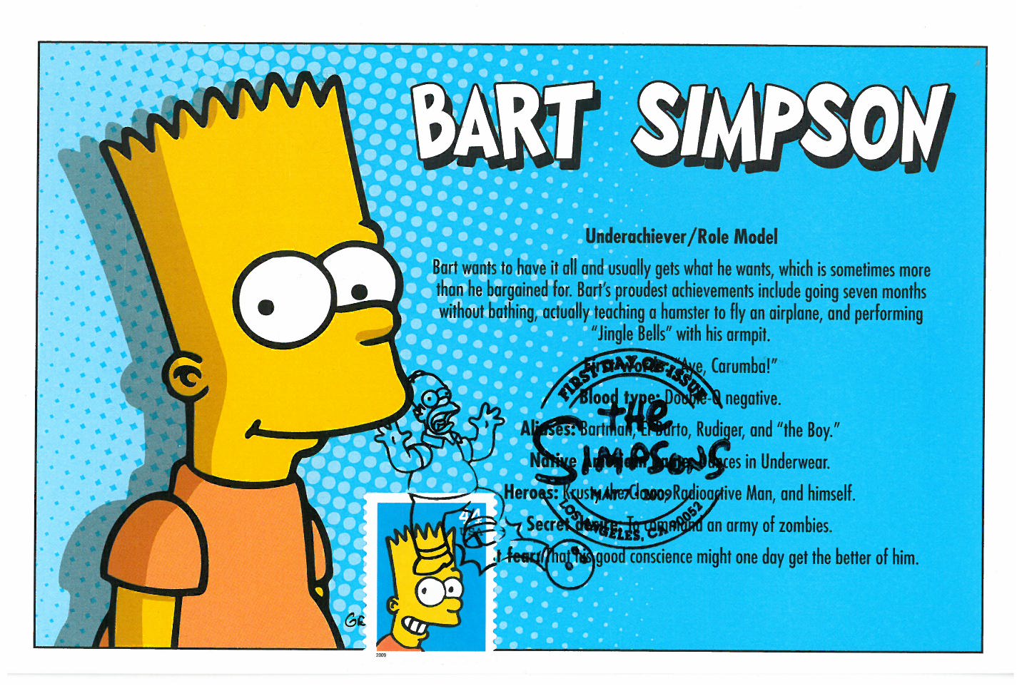
This profile of Bart Simpson (Scott #4401) also has a slightly different facial expression but given the matching background color, also comes very close as well.

And of all 20 different Disney stamps issued between 2004 and 2008, this stamp from Lady and the Tramp (Scott #4028) most closely resembles any of the postcards I used for the First-Day-of-Issue postmark.



Thursday, September 22, 2011

We Don't Need Another Hero


Four big budget comic book movies this past summer, and while none were overtly bad, none was particularly good, either. The period playfulness of Captain America’s production values and Michael Fassbinder’s commitment to Magneto stood out, but it was mostly silly and disappointing, though not the last we’ll see of any of them I suspect (except perhaps Green Lantern - Scott #4084l).

The DC and Marvel comic postage issues yielded few opportunities for movie-related FDC’s (at least based on my collection), but I had other postcards at my disposal. The X-Men one (Scott #4159t) was the best because it’s a true Maximum Card, with the stamp and the postcard being exactly identical. As for poor Thor, he didn’t even merit his own stamp, though you can see him way in the background of Cap’s stamp (Scott #4159o). For his comic, I settled for the Spider-Woman cover stamp (Scott #4159q), since it also features Nick Fury, who will be wrangling the Avengers for next year.

Thursday, August 11, 2011

Here Comes the Smudge


You already know about my first encounter with the USPS and first-day-of-issue postmarks.  But the cover I scanned in that post was one I bought onsite.  However, on that day, I also brought some classic film star postcards myself to get my own postmarks—the first time I’d ever tried this.


Note all the black ink smudges on the left side of each card.  As you can see, this was not such a great idea. 

That day, the postal employees with the cancellation stamp were in the lobby of San Francisco’s magnificent Castro theater, and as I gave them the postcards, they stamped each one individually.  However, the ink on the cancellations didn’t have a chance to dry before they handed the cards back to me in a stack, ready to move on to to the next customer.  As a result, ink from the back of one postcard (where the postage stamp was) ended up partially defacing the front of another postcard (with the image) in the stack.  If I had known better, I would’ve put the postage stamp on the front, with the image, so even though the cancellation might still get a little smudged, it would only end up marking up the back of the next postcard, which nobody would see. 

I don’t know how the Postmaster stations handle it now, with the large volumes of covers and cards they must receive for each new issue, but I’ve never had a problem with the cards smudging merely from touching each other (and believe me, on some issues, I’ve given them an enormous amount of cards to stamp).  Sometimes, I imagine some sad little postal worker at a small table in a windowless room, holding a cancellation stamp, inking it, and then pressing down on one mass-produced envelope after another.  And another.  And another.  I know my postcards are unique in this respect, since they’re created by hand, different from anything else this employee would encounter.  Do they represent a welcome change of pace to this lonely worker?  Do they enjoy my attempts at creativity in assembling the cards?  Or is it just another part of the job they look forward to putting behind them?
Yes, I actually wonder about these things.

Harold Lloyd is Scott #2825 and Rudolph Valentino # 2819.

Tuesday, July 19, 2011

Great Scott


It’s hard to believe that Thelma & Louise was released 20 years ago. I was in college at the time and remember all the controversy about feminist outrage and confronting misogyny (both overt and latent). I haven’t seen it again since—it’s not the type of film that gets replayed on TNT the way other “chicks with guns” films like Aliens and Terminator 2 are. But I remember that even back then, the Grand Canyon jump was a cheap and inauthentic end to two beautifully realized characters, with the final freeze frame of the car in the air a royal cop-out to an otherwise engaging movie.

What I liked about the film most, though (besides some terrific performances across the board) was that it was the only film that gave Ridley Scott visual breathing room. From Alien to Blade Runner to Black Rain, his films were suffused with imagery that was wet and dark and claustrophobic. But this film showed that he can handle sunshine and wide open spaces, that he had a directorial gift for American landscape as a complement to his heroines’ road trip. Sadly, even though subsequent efforts like Blackhawk Down and Gladiator take place largely outdoors, the style is still visually cluttered and oppressive. Thelma is a window into a career that might have been—a spare, linear, natural sensibility that allows for the fact that empty space need not be devoid of ideas.

I love to go camping and have been to the Grand Canyon, but never both together (nor have I explored farther than the south rim). Hopefully one day. The Grand Canyon stamp (Scott #4054) from the Wonders of America series gave me an opportunity to pull some older Grand Canyon stamps as well, the oldest of which is from 1934 (Scott #741) as part of a National Parks series. The other two are Scott #2512 & C135 (which designates an Air Mail stamp).

Sunday, June 19, 2011

Polite Society


Although we're constantly overrun with inferior remakes these days, it's not a new phenomenon. This still has Frank Sinatra (Scott #4265) and Bing Crosby (Scott #2850) serenade each other in High Society (Walters, 1956), a musical revisitation of the superior The Philadelphia Story. While the original Cukor film is spritzy, it still has emotional weight. But High is just that: light as a feather, cute and charming but of no real consequence, with zero sexual chemistry and musical numbers, despite the involvement of such heavy-hitters, that evaporate as soon as you've heard them.

I’ve included the one sheet, which also has the stamps for Grace Kelly (Scott #2749); Cole Porter (Scott #2550),who wrote the entire score; and the Rhode Island stamp (Scott #3599) from the Greetings from America series, complete with sailboat, one of which is prominently featured in the film. Paired up with the Porter stamp is the Music stamp (Scott #3772d) from the American Filmmaking series, complete with Oscar silhouette on the postmark (Porter was nominated for his song “True Love”, which was also the name of the sailboat in the film).

You’ll also notice that the two Louis Armstrong stamps are slightly different from each other, with the lettering alternating between white and black (the difference being that one was sold individually, while the other was sold as part of a strip with other jazz legends). The Scott #’s are 2982 and 2984 respectively.

Monday, May 30, 2011

Happy Birthday, Gracie


Last fall, I visited my sister and her family for the first time since they moved to Pennsylvania, and my niece’s room was tricked out in full Disney princess regalia, so this post is for her on her 5th birthday.  

The postcard is lenticular and the Scott #’s for Ariel, Snow, Cinderella, and Belle are 3914, 3915, 4026, and 4027, respectively.

Thursday, April 7, 2011

American Beauty


Elizabeth Taylor is one of those actresses who was legendary and much-celebrated but, for my generation, is better known for the drama of her life than the liveliness of her dramas. Her death is also bittersweet because while she was, in her prime, a truly epic beauty, I am hard-pressed to think of a single film of hers I’d want to revisit. Perhaps National Velvet (Brown, 1944) comes closest. Not that her movies were bad; Father of the Bride, A Place in the Sun, Who’s Afraid of Virginia Woolf? are all worth seeking out.

But none of them hold a special place in my heart. Perhaps the burden of being so gorgeous was that there was an implicit obligation to sweep her away in glamour and grandeur, with very little room for light, playful romance. So many of her films, once she reached sexual maturity, seem to take themselves far too seriously (to these eyes at least). And while she’s hotter than a Roman candle in Cat on a Hot Tin Roof, very rarely do I ever want to project myself into her films, filling the shoes of a Newman or Clift or Burton. Movies are the dream factory, but her films are someone else’s fantasies, not mine.

But there is plenty of evidence that she had enormous integrity and compassion, and had to shoulder her fair amount of loss and heartache along the way (much of it far too public in nature). So she still remains a legend to me, transcending art and becoming something more, both elusive and lovely.

While she played Tennessee William’s Maggie, she also played Matt Groening’s, too. And until she gets her own stamp, this beautiful still, with the Simpsons’ youngest (Scott #4403) in the corner, will suffice.